Python 視覺化套件使用經驗
Python套件多,品質不一。用module之前,我習慣先看github星星確認認可度,有1000個以上多是品質保證,再看release history,看是否有被持續維護,那種2年以上沒新版本的,採坑機率高。Bokeh看來沒問題。
~Python互動式圖表函數庫初體驗 1")
平常python視覺化的主力套件是matplotlib和seaborn,前者是20歲老套件,是視覺化元祖,許多套件基礎都是建構在matplotlib上,像seaborn就是,有更簡潔的寫法和精美圖例,兩者都以靜態視覺居多,缺乏變化性(或是要費點功)。
Python守備範圍廣,但在網頁前端仍難以與Java Script抗衡,而D3.js函數庫也要花不少學習成本,有沒有辦法用Python做出JS動態視覺的效果?
Bokeh的出世,提供了Python與D3.js之間的橋梁,讓你可以用Python做出D3.js常用功能的效果,減少學習成本,高效開發,輕鬆描述統計結果。
厲害在哪裡?
先來看Gallory,python視覺化套件很多,範例圖不夠精美的,可考慮跳過。
- 化學元素週期表
~Python互動式圖表函數庫初體驗 2")
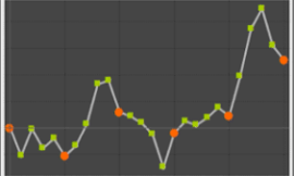
- 雷達圖
~Python互動式圖表函數庫初體驗 3")
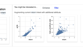
- 互動式wiget散點圖表
~Python互動式圖表函數庫初體驗 4")
逛了一圈,發現Bokeh圖表精美、範例多、都有附原始碼,官方教學也完整,有tutorial jupyter檔案教學。
看來比matplotlib強大,也比plotly漂亮…,函數庫使用看來也不難,且可鑲嵌到Django等Web框架,無論是local或遠端的前端呈現都可以效率開發。
開箱試玩時間
要注意的是bokeh會預設連BokehJS cdn,但連線有時不是很穩定,這時可多加”INLINE”環境變數設定,讓BokehJS驅動於local python env。
from bokeh.resources import INLINE
bokeh.io.output_notebook(INLINE)Bokeh可以在Jupyter呈現開發也可以跳轉出html檔,可自由設定,預設是跳轉html檔(output_file())。若要更改預設,必須加上bokeh.io.reset_output()重設環境預設。
output_notebook() #jupyter呈現
output_file()  #html呈現
fig物件可設定tools參數,圖表會自帶縮放、重整、儲存等功能。
以下是參考官方範例後微調的程式。
from bokeh.plotting import figure, output_file, show, output_notebook
import bokeh.io
from bokeh.resources import INLINE

# env settings 環境變數設定
bokeh.io.reset_output()
bokeh.io.output_notebook(INLINE)

# prepare some data
x = [0.1, 0.5, 1.0, 1.5, 2.0, 2.5, 3.0]
y0 = [i**2 for i in x]
y1 = [10**i for i in x]
y2 = [10**(i**2) for i in x]

# output to static HTML file
# output_file("log_lines.html")

# create a new plot
p = figure(
tools="pan,box_zoom,reset,save",
y_axis_type="log", y_range=[0.001, 10**11], title="log axis example",
x_axis_label='sections', y_axis_label='particles'
)

# add some renderers
p.line(x, x, legend_label="y=x")
p.circle(x, x, legend_label="y=x", fill_color="white", size=8)
p.line(x, y0, legend_label="y=x^2", line_width=3)
p.line(x, y1, legend_label="y=10^x", line_color="red")
p.circle(x, y1, legend_label="y=10^x", fill_color="red", line_color="red", size=6)
p.line(x, y2, legend_label="y=10^x^2", line_color="orange", line_dash="4 4")

# show the results
show(p)
output_notebook() ~Python互動式圖表函數庫初體驗 5")
投資圖表試玩
Bokeh官方有提供sample_data給大家練習,gallery豐富的範例都取自sample_data,對比官方的資料格式就能輕鬆模仿應用,沒啥高深程式技巧。下載sample_data指令為bokeh.sampledata.download(),直接貼在jupyter執行。檔案會下載到bokeh module裡。
檢查蘋果電腦範例資料(json)
from bokeh.sampledata.stocks import AAPL
# 檢查欄位
AAPL.keys()
#dict_keys(['date', 'open', 'high', 'low', 'close', 'volume', 'adj_close'])
ColumnDataSource物件為Bokeh資料驅動渲染核心
dataframe要傳入ColumnDataSource才能驅動js。
providing the data that is visualized by the glyphs of the plot
https://docs.bokeh.org/en/latest/docs/user_guide/data.html
HoverTool
游標滑過時顯示資料
Click_policy
藉由標籤控制數值顯示
hide為隱藏,mute為切換自訂顯示模式
可在muted_color控制顏色, muted_alpha控制顏色濃淡
程式範例
import bokeh.io
from bokeh.resources import INLINE
from bokeh.models import HoverTool
from bokeh.palettes import Spectral4
from bokeh.plotting import figure, output_file, show, output_notebook, ColumnDataSource
from bokeh.sampledata.stocks import AAPL, GOOG, IBM, MSFT
import pandas as pd
# env settings
bokeh.io.reset_output()
bokeh.io.output_notebook(INLINE)
# set hover
## HoverTool
# 游標滑過時顯示資料,date格式需要轉換,不然會是timestamp
hover = HoverTool(
tooltips = [
("date", "@date"),
("close", "@open"),
("close", "@close"),
("high", "@high"),
("low", "@low"),
("volume","@volume")
],
formatters={"@date":"datetime"}
)
# set figure
p = figure(
plot_width=1000,
plot_height=400,
x_axis_type="datetime",
tools=[hover,"pan,box_zoom,reset,save"],
)
p.title.text = 'Stock_Price--Click on legend entries to mute the corresponding lines and show daily details in hover'
# use ColumnDataSource to control
# click_policy
# 藉由標籤控制數值顯示
# hide為隱藏,mute為切換自訂顯示模式
# 可在muted_color控制顏色, muted_alpha控制顏色濃淡
for data, name, color in zip([AAPL, IBM, MSFT, GOOG], ["AAPL", "IBM", "MSFT", "GOOG"], Spectral4):
df = pd.DataFrame(data)
df['date'] = pd.to_datetime(df['date'])
source = ColumnDataSource(df)
p.line(x="date",y="close", line_width=2, color=color, alpha=0.8,
muted_color=color, muted_alpha=0.2, legend_label=name,source=source)
p.legend.location = "top_left"
# use hide or mute
p.legend.click_policy="mute"
# output_file("interactive_legend.html", title="interactive_legend.py example")
show(p)
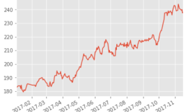
output_notebook() 兩種模式結果比較
- Mute
~Python互動式圖表函數庫初體驗 6")
2. Hide
~Python互動式圖表函數庫初體驗 7")
小結
這篇主要是來體會一下Bokeh的效果,不用會JS,隨便玩就有這種效果,蠻滿意的,值得再深入一下細節,把以前matplotlib的圖表都轉來bokeh,無論是在工作上的資料報告還是看盤需要,都蠻方便的。
假如想要進一步學習 Bokeh,我將會分享一系列文章,來介紹 Bokeh 在投資領域的視覺化喔!
下一篇文章,帶你繪製專業的股價和技術指標!